Creative that Stains
You need a bigger screen
Know how things in your rearview mirror appear closer than they seem? We're much more talented and impressive on devices bigger than your phone.
This email address is being protected from spambots. You need JavaScript enabled to view it. and we'll bring our dog and pony show to you… and we'll spring for the coffee.
Creativity is unafraid of contact with commercial endeavors
Some of the most beautiful works of art in the world were produced solely to pay the rent.
Necessity is a powerful force in the world. Desperation is one mother of a muse. Hunger is a great motivator. Together, they have the power to focus the mind with frightening efficiency and can clear a room of weak ideas faster than spilled skunk oil.
As long as ideas are extraordinary and powerful who cares why or where they were born?
Fortunately, it’s easy to tell weak ideas from powerful ones, even when you’re standing toe-to-toe with a deadline.
Weak ideas make you feel safe, comfortable, and sleepy.
Powerful ideas make your palms sweat.
And nothing good happens without a little honest sweat.
What We Do
Packaging
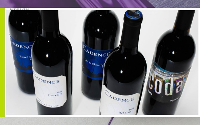
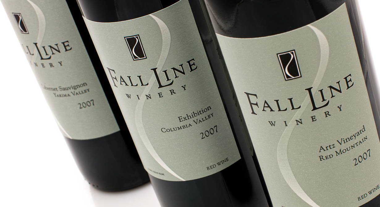
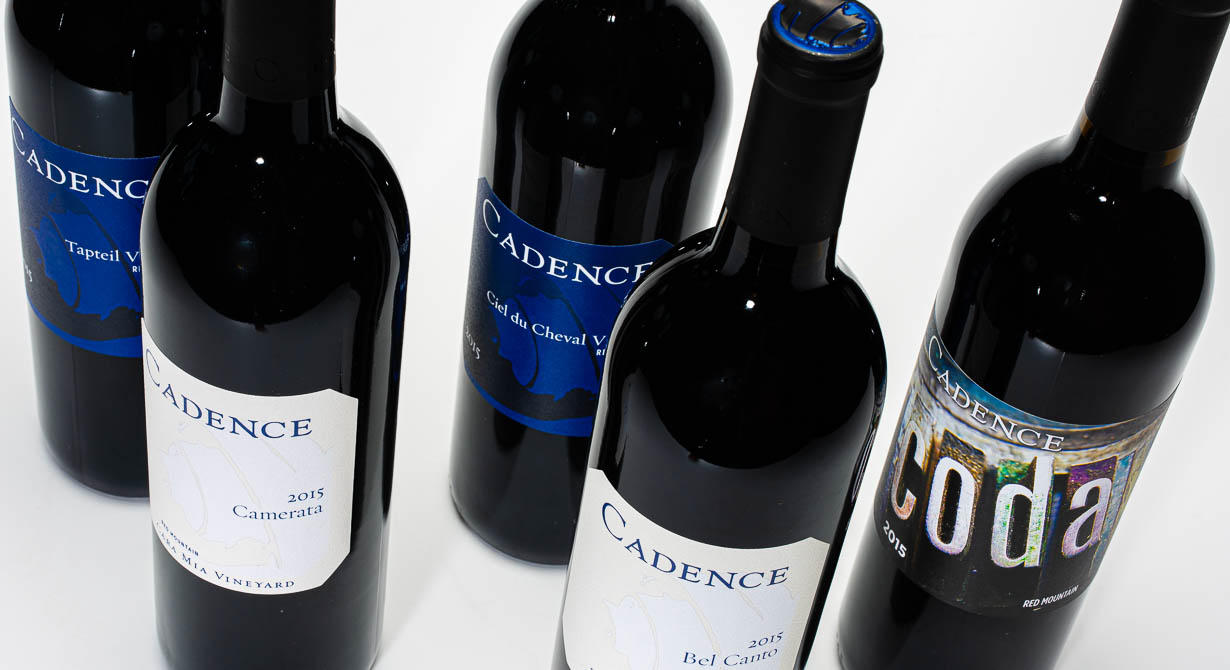
Product labeling and package design is an exercise in fly fishing. We read the river, decide which delicious bugs are falling from the trees, then gracefully cast an olive wooly bugger into the riffles just past our target. A flash of silver and the strike; we play the line, keeping it tight… (sorry, got caught up in the metaphor). Our goal is to hook your customers by the eyeballs and reel them in.
Ads & Promotion
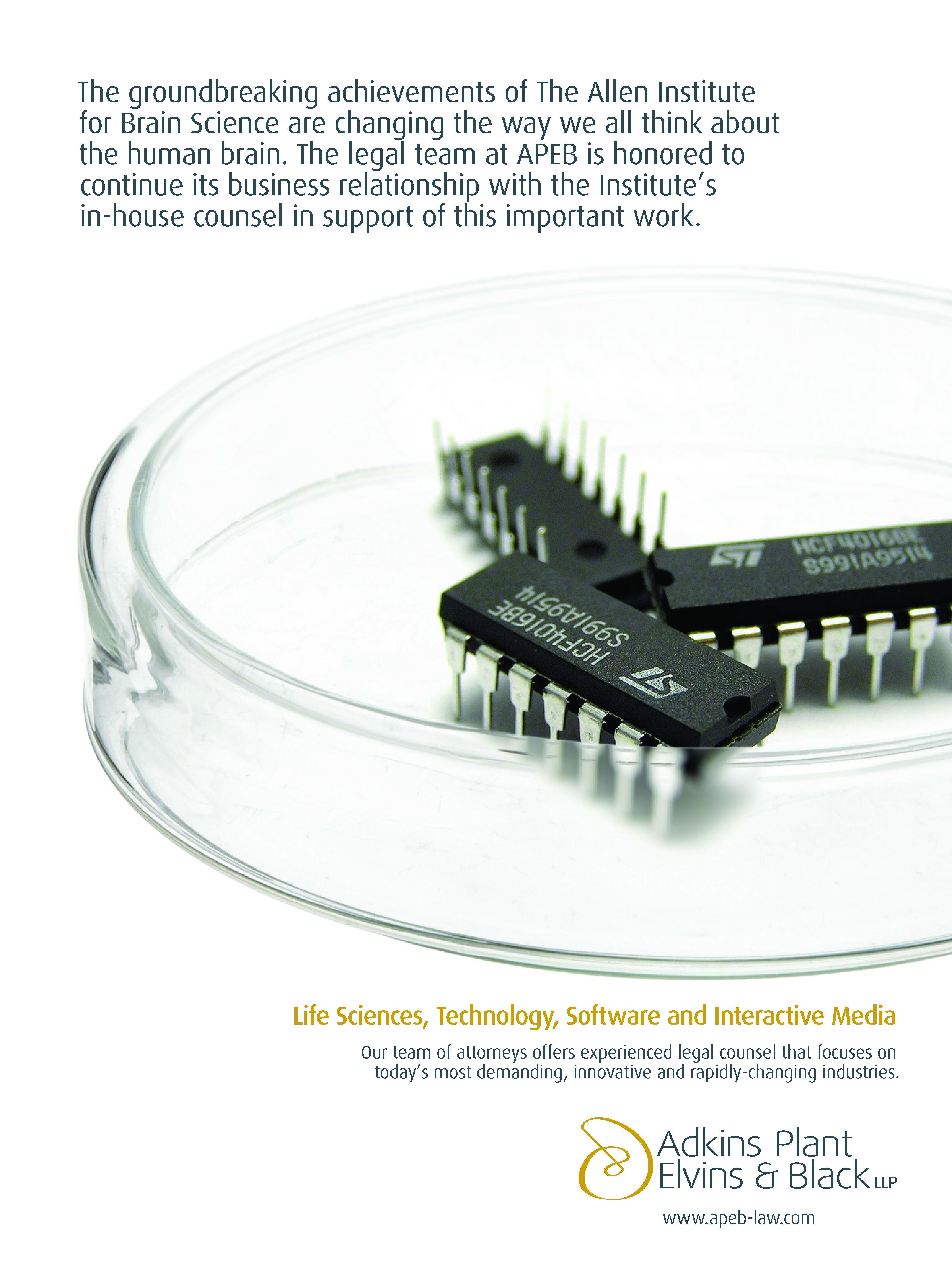
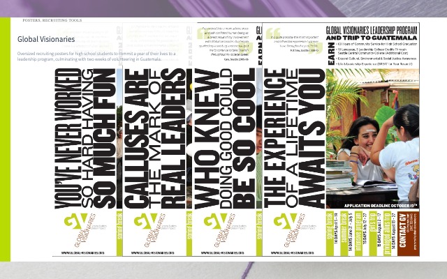
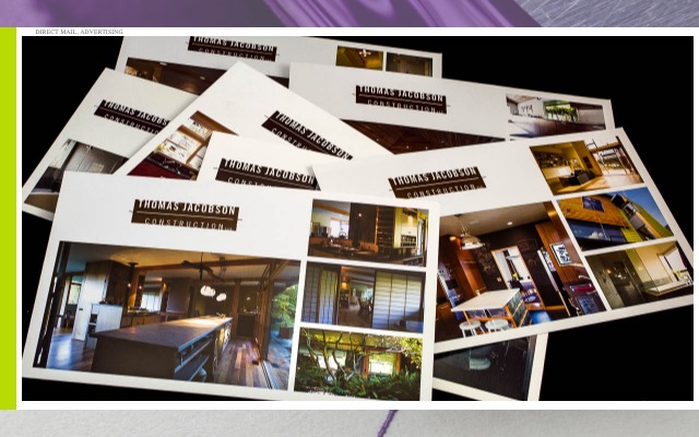
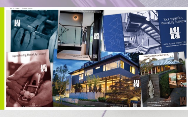
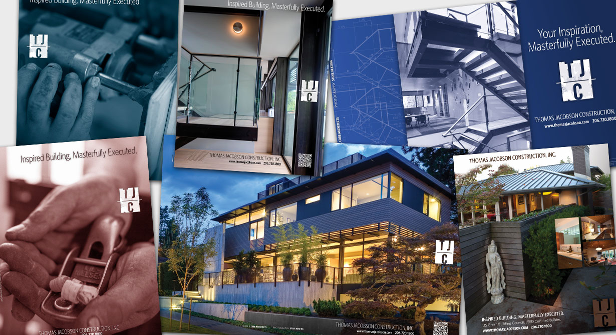
However, if we were to go on we would stress the delicate balance between pithy copywriting, great art direction, and establishing continuity and clarity around the business. Then we might chat awhile about frequency, demographics and distinguishing brand positions in an otherwise crowded market space.
But you already knew that.
Collateral
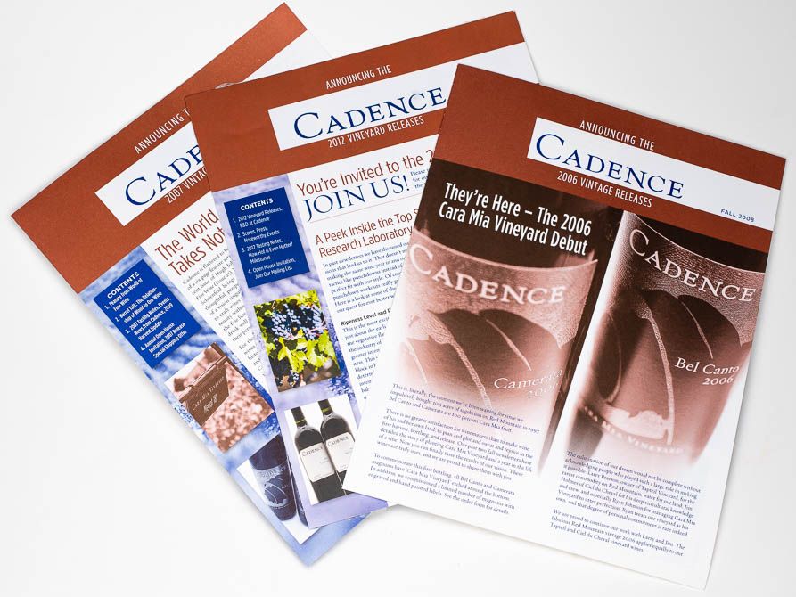
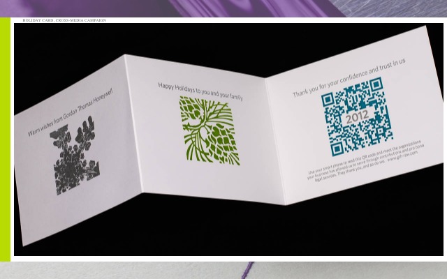
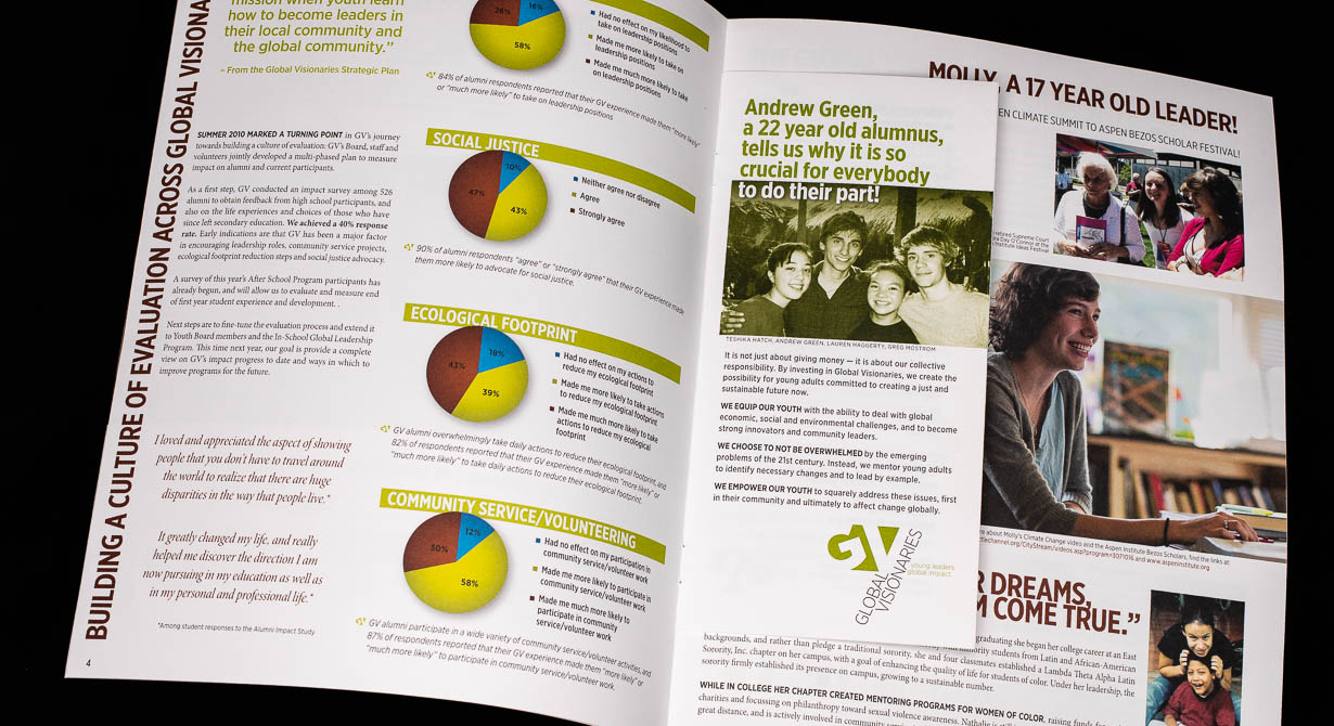
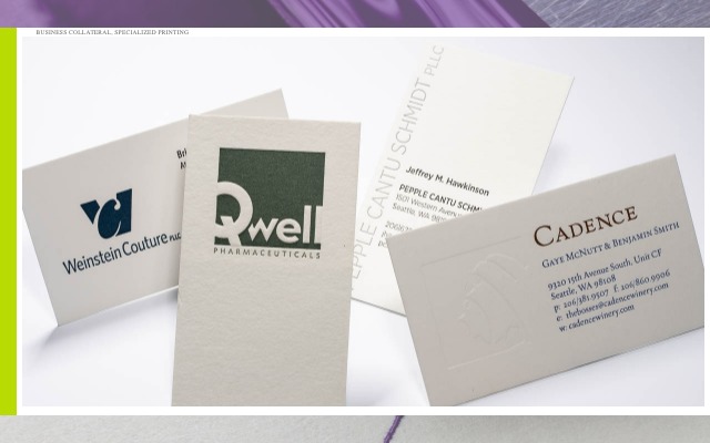
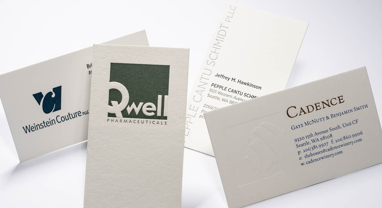
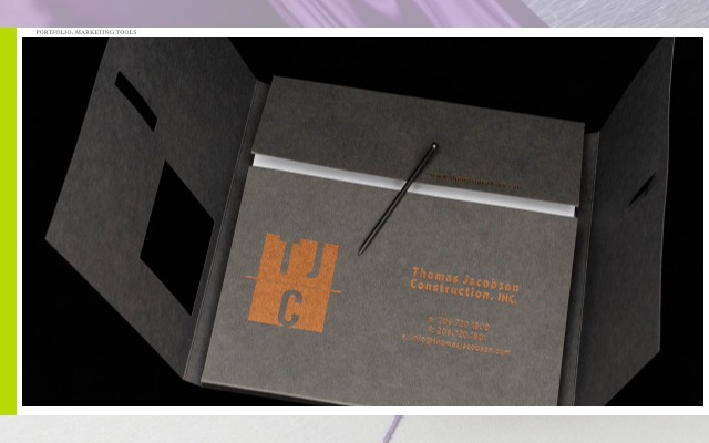
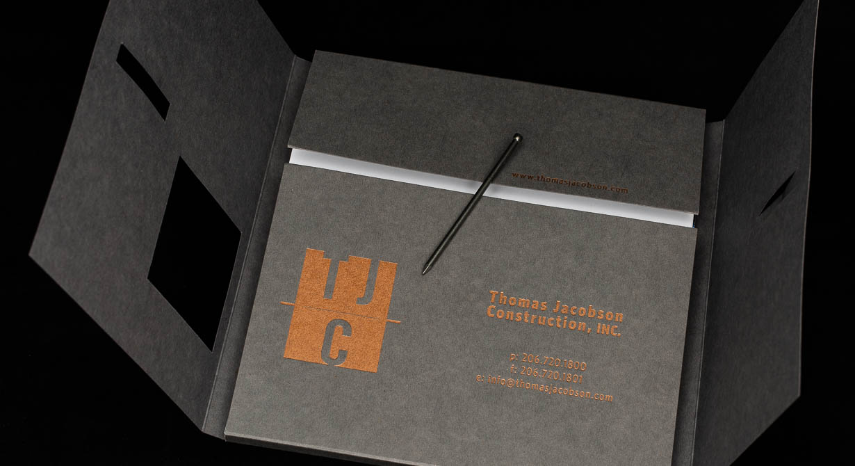
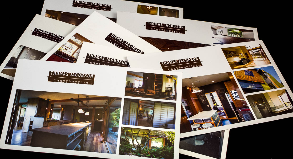
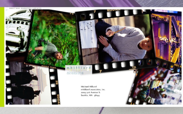
We love a business card that feels both precious yet thick enough to double as a ninja star — or it could scrape your windshield on frosty mornings. Our collateral spans digital to 6-color offset to printing on a century-old letterpress with ancient, metallic sparkle dust (yeah, that's real and very cool). Honestly, who was the last person to comment on the impression and tactile nature of the pixels in your email signature?
Long-Form
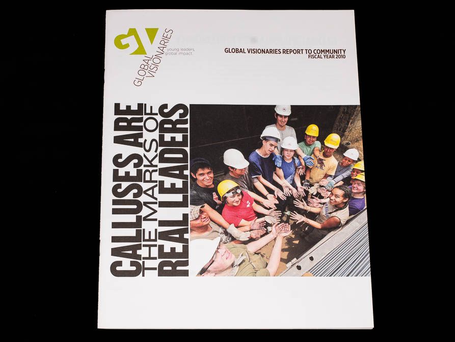
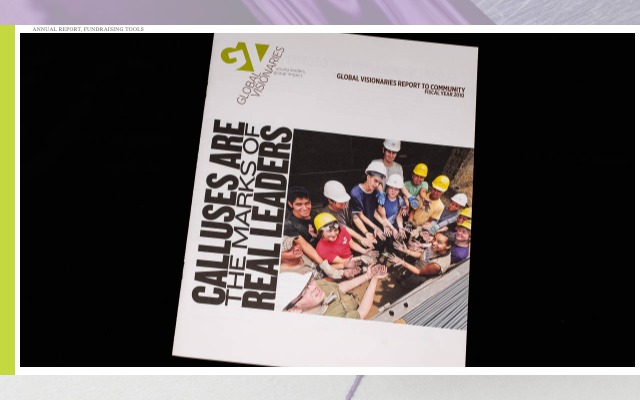
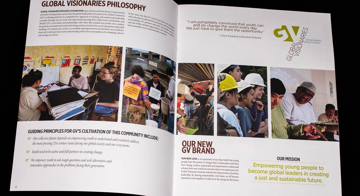
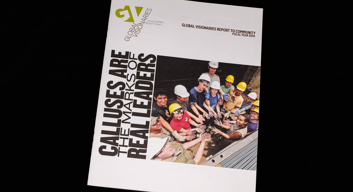
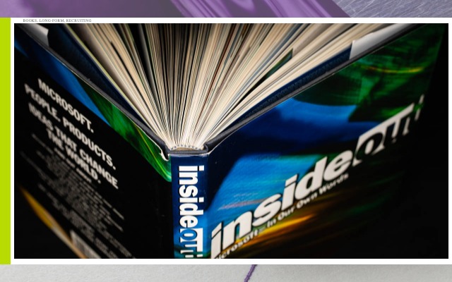
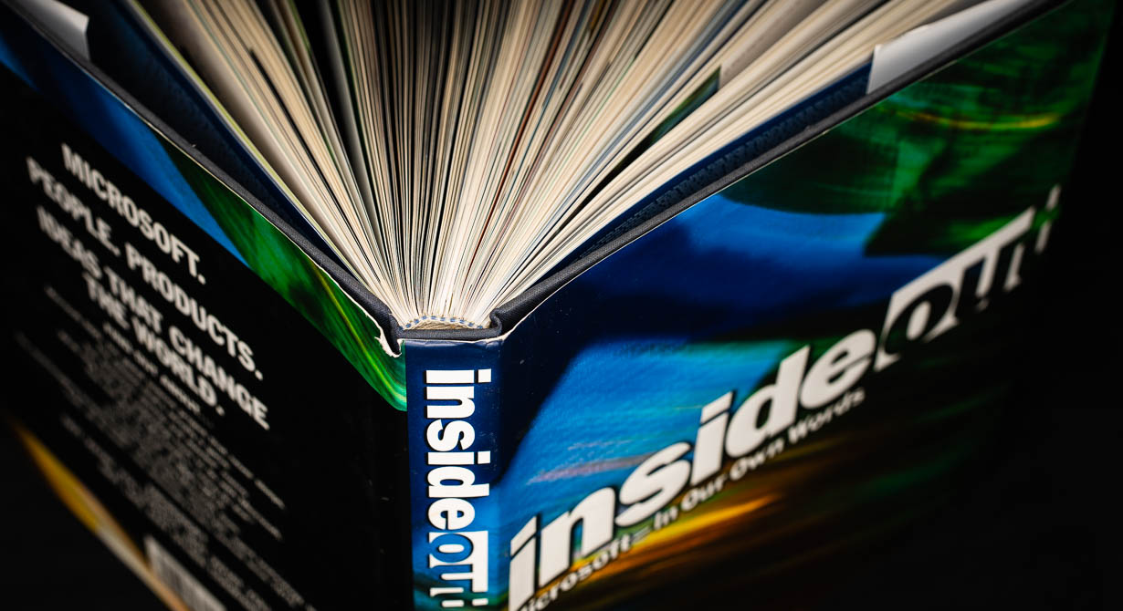
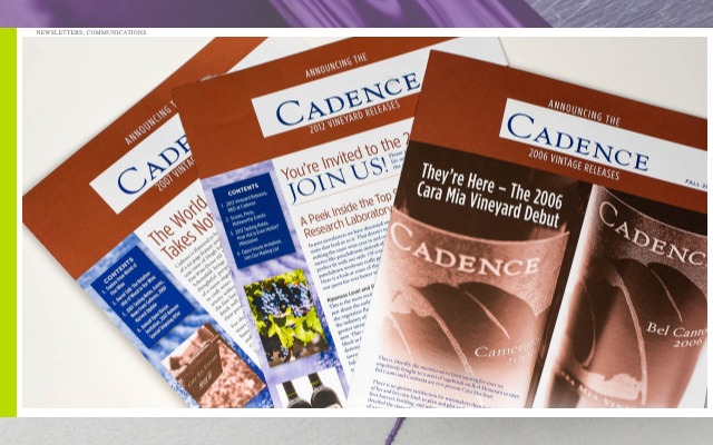
Books, magazines, catalogs and an entire university system of coursework, programs and viewbooks. Decades of ink are under our nails, and like every creative worth their salt, the first thing we do with a new publication is to crack open the pages and take a deep sniff.
Probably explains some behavior, that.
Brochures
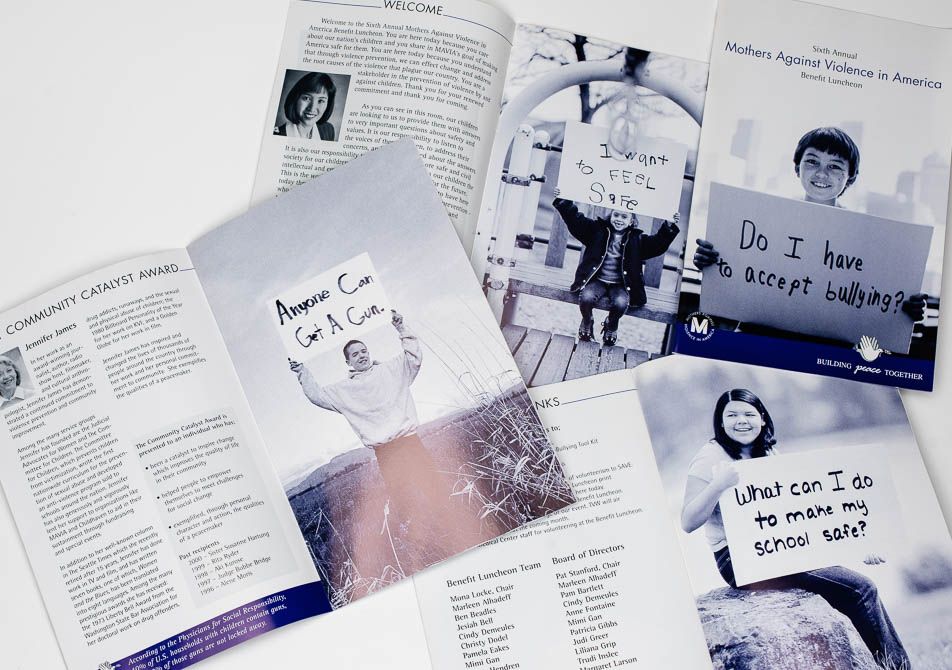
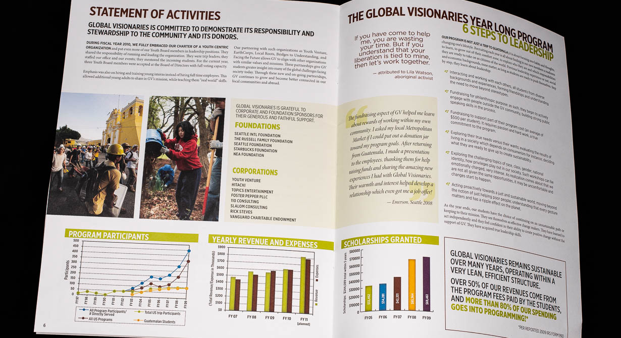
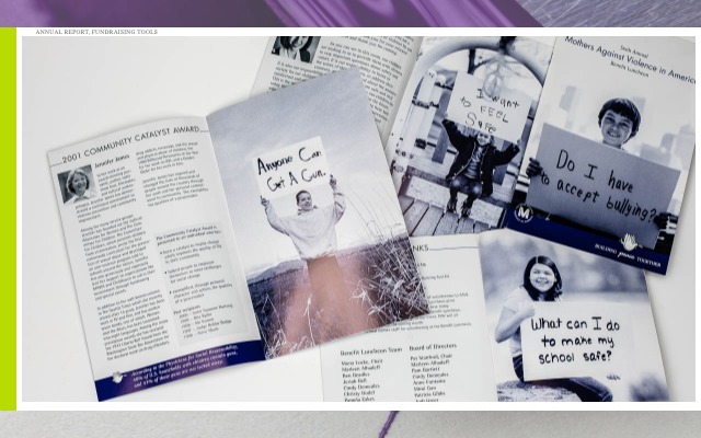
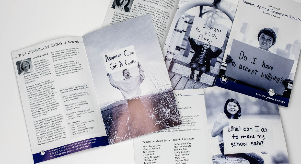
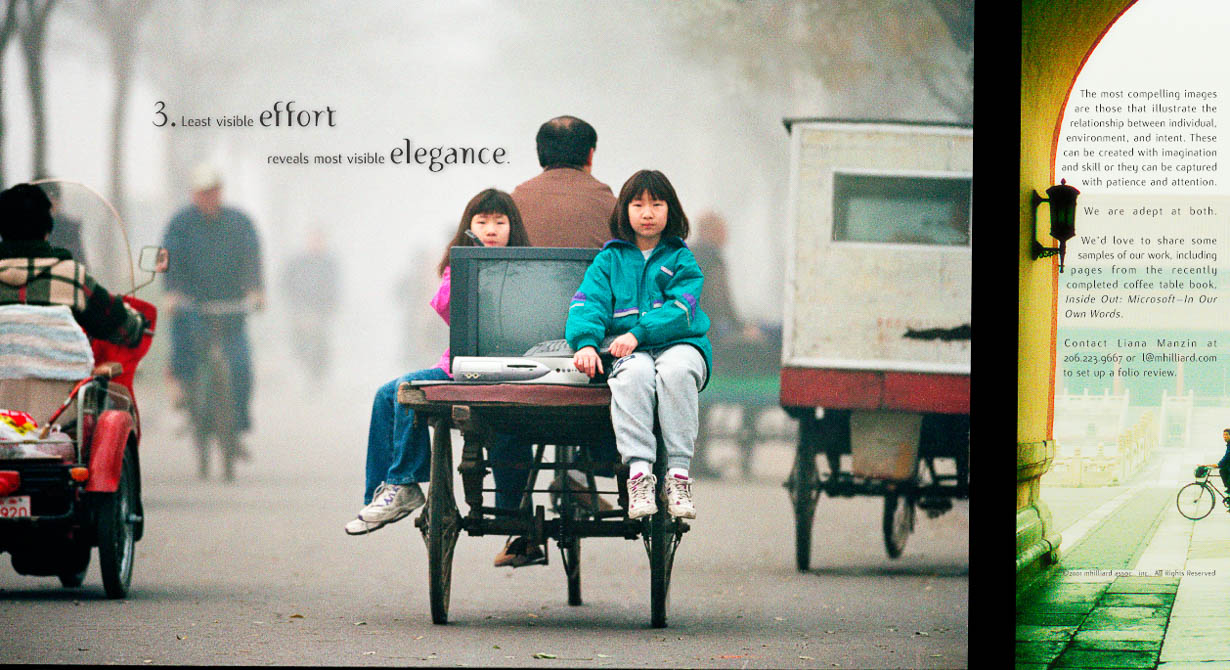
Successful brochures are clear, visually compelling and linked into larger communications systems (ideally digitally integrated). They always start with scribbles and hasty-looking mockups, organizing flow and ideas into a polished solution, leading readers to a call-to-action and organic conclusion. Only after the initial research do we get to break out the crayons and have some fun.
Presentations
Tangible presentations are equal parts ceremony, multi-directional narrative, and very versatile: Client-paced, non-linear, allowing for digressive exploration. An audience feels the presenter curated the content specifically to them. Systems we’re most proud of cover lots of information but feel much like a quiet story unfolding, and customizable for multiple audiences and messages.

